Why Are We Still Getting Color Wrong? (2025 Color Trends Guide)
2025 color trends are bold, grounded, and full of life—but let’s be honest: many homeowners are still using them the wrong way. From flat neutral spaces to mismatched undertones, the most common color mistakes haven’t changed much… even as the palettes have.
After years of styling homes and writing about interiors, I’ve noticed the same color blunders popping up again and again—and no, it’s not about pushing your sofa too close to the wall (though let’s not do that either). It’s something deeper, and sneakier: how we use color—or don’t.
Let me back up. In 2022, I helped a friend refresh her living room. She chose all the “safe” neutrals: soft gray walls, white curtains, pale oak floors. On paper, it worked. But the room felt… blah. Even after layering in throw pillows and art, it lacked energy.
2025 Color Trends
“We’re so afraid to make color mistakes, we forget to make color choices.”
And honestly? That fear is still showing up in homes today. But 2025 is not the year for playing it safe. It’s the year of warmth, personality, and human energy.
Here’s how to avoid the most common color mistakes I see every week—and how to fix them using this year’s trends.
🎯 Why Most Color Palettes Still Fall Flat in 2025
It’s not bad taste—it’s hesitation. Many spaces default to grays, whites, and muted blues because they feel “safe.” But safe can also feel lifeless.
Does this sound familiar?
You choose a beautiful neutral paint, add white curtains, and think you’re done. But months later, your space feels cold, generic, or like it’s missing something. That’s because color doesn’t work in isolation. It needs texture, light, and contrast to come alive.
❌ Common Color Mistakes (and Why They Happen)
1️⃣ Over-relying on Neutrals
Neutral palettes feel timeless, but without variety they can fall flat.
Why it happens: Fear of choosing “wrong” colors pushes us into all-beige or all-gray spaces.
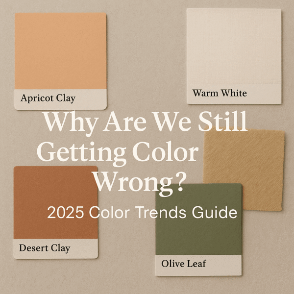
Quick Fix: Try earthy alternatives like Desert Clay or Apricot Crush, paired with natural textures like linen or raw wood.
2️⃣ Ignoring Undertones
Not all beige is created equal. A beige with pink undertones might clash horribly with yellow-toned oak floors.
Why it happens: Undertones are hard to spot until it’s too late.
Quick Fix: Always test large paint swatches in natural and artificial light. In 2025, Olive Leaf Green is a safe yet sophisticated choice that plays well with wood and brass.
3️⃣ Choosing Paint First
You pick a wall color you love… only to realize later that your furniture and rugs don’t match.
Why it happens: Paint feels like the easiest place to start, but it sets limitations.
Quick Fix: Start with a rug, artwork, or textile you adore. Build your palette around that anchor, then choose paint last.
💡 Pro Tip: Neutrals aren’t dead—but they need support. Layer raw wood, linen, brass, and pops of color for depth.
🖌 2025 Color Trends That Actually Work
This year’s palette is all about earth-inspired tones, rich contrasts, and emotional connection. It’s less about sterile minimalism and more about grounded, human-centered spaces.
2025 color trends
“This year’s palette invites you to live with warmth and personality—not just color.”
💡 Designer-Approved Fixes for Color Confidence
You don’t need to gut your home to get color right. Start with these quick wins:
✅ Use the 60-30-10 Rule
This classic formula keeps rooms balanced:
60% dominant color (walls)
30% secondary (furniture, rugs)
10% accent (pillows, art)
Try pairing Warm White walls (60%) with Olive Green furniture (30%) and Mellow Yellow pillows (10%).
60-300-10 Rule
✅ Consider Light Direction
North-facing rooms feel cooler: Choose warm tones like Apricot Crush.
South-facing rooms get golden light: Try moody hues like Charcoal Black.
✅ Don’t Forget the Ceiling
Painting the “fifth wall” a subtle tone adds intimacy. Try off-white, dusty pink, or pale blue.
🎨 Example Color Combo:
Earthy Modern-Moodboard
Warm Minimalism-Moodboard
Modern Boho Moodboard
Moody Chic-MoodboardSunwashed Mediterranean
🧠 The Psychology of Color in 2025: Designing Spaces That Feel Alive
In 2025, color isn’t just about aesthetics—it’s about emotion. The shades you surround yourself with influence more than your walls; they shape your mood, your energy, and even your relationships.
Here’s what designers are seeing this year:
🚨 Top 5 Color Mistakes Designers Still See
Choosing paint before furniture
Ignoring natural light
Over-matching accessories
Using too many bold colors together
Leaving ceilings stark white
💡 Quick Fix: Start small. A painted chair. A new pillow. A bold lampshade. Build confidence one piece at a time.
🔚 Final Thoughts: Start Small, Go Bold
Color doesn’t just decorate—it defines. It influences your mood, creativity, even relationships.
Instead of copying Pinterest boards, ask yourself:
“What colors feel like me? What shades make my home feel alive?”
2025 is your year to experiment. And if you mess up? It’s only paint. But it changes everything.